COVID19.PINK
Open-source data visualization
Open-source COVID-19 dashboard with an interactive map and trends.
Project description
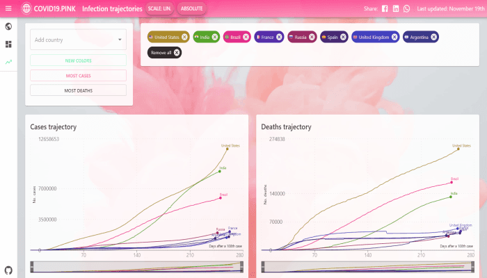
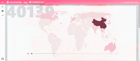
COVID19.PINK provides an interactive map, infection trajectory analysis, and country dashboards for engaging people in analysing situation during the pandemic.
Overview
From the start of the pandemic, I appreciated how easily accessible data was but I found the available dashboards hard to read, not easy to interpret and not very engaging.
- a more readable map with a time travel capability
- for comparing infection trajectories to easily interpret where in the stages of pandemic your country is
Additional Information
The application was built as an open-source side project during the early weeks of the COVID-19 pandemic in 2020 to help people better understand the situation through engaging data visualization. At the time I thought the pandemic might last a few weeks or months so the code wasn't optimised for as much data as the application ended up handling.